

PIPRA - Responsive Web Design
Role: UX Researcher, Product Designer
Duration: 2 weeks, 80 hours
Tools: Figma, Sketch, Adobe Illustrator
Final Prototype: View Here
PIPRA is a Swiss med-tech start up that is developing an AI-based pre-operative screening tool to assess the risk of patients developing cognitive deficits as a result of surgery. PIPRA had an existing website that they wanted to have redesigned. I acted as an end-to-end product designer, conducting user research, creating a responsive web design, and prototyping the product. This project took 80 hours.
Empathize
During the empathize phase, I completed a competitor analysis, conducted user interviews, and created a persona based on a typical group of users.
Competitor Analysis
A competitor analysis was conducted upon primary and secondary competitors. This study found the strengths and weaknesses of our competitors and provided insights into how we should develop our product. This research determined that the strengths of med-tech websites are to include comprehensive information about the products and utilize interesting color schemes and graphics to make their company stand out.
Customer Interviews
Customer interviews were held with five physicians age 37-69, four of whom were in the US and one was in the target location of Switzerland. Each interview lasted approximately 20 minutes and consisted of understanding the participants’ experience with learning about new medical technologies to incorporate into their practice, specific thoughts on those types of websites, motivations around deciding to choose a new medical product to use in their practice, and their pain points in the process.
Overview of Findings
Discovering New Products
Physicians typically find out about new medical technologies from conferences, journal articles, recommendations from colleagues, and recommendations from the medical societies they belong to. Some find out through direct marketing.
All participants mentioned that their patients are their top priority and that new technologies must be good for their patients.
Motivation and Trust
Peer reviewed research studies about the product is very important, would not be willing to look further into something if it’s not backed by research
Most participants get their recommendations from medical organizations they belong to (ie: American Medical Association), and would not use a new product if it wasn’t recommended by one of their societies
Accuracy and effectiveness of products is high priority for doctors
Important information on sites include: concise description, research backing it up, recommendations or seal of approval from major medical organizations/societies, information about price, info about benefits to patients
Pain Points
Physicians don’t like feeling marketed to, they prefer to have recommendations from societies, research that has backed it up, recommendations from doctors they know
Doctor and hospital partnerships aren’t as important some doctors because there’s concern about them being biased towards products
Cost is especially important for private practice physicians since they function more similarly to a small business, where their costs vs rewards is an important factor
One doctor mentioned the importance of a website looking professional and modern, if it’s a tech company it’s hard to trust it if it has an outdated or ugly website
For doctors who work within public hospitals/health care systems, there is often a lot of bureaucratic and higher up approval needed to implement new products
Provisional Persona
A provisional persona was created based on the competitor analysis and customer research. The main goals for this persona were to engage with products that are safe and beneficial for their patients, interact with a website that instills a sense of trust with the company and product, and to have a pleasant experience navigating the company’s website.
Define
During the define page, the project goals were outlined and a task flow with the site organization was created.
Project Goals
After conducting research on competitors and users, I used this information and the project brief to outline business goals and user goals, and determine where those goals intersect. This helped me to see which of the goals were the most important to address from both a business and user standpoint. The most important goals were to have a clear and comprehensive explanation of the company and product, instill a sense of trust with the user, and have a modern and clean UI.
Task Flow
Keeping all of the previous research and defining top of mind, I put together task flow to help determine the site layout and information hierarchy. This task flow is focused on the overall goal of the project and users, to give the users enough information about the company so that they will then be encouraged to reach out to PIPRA to learn more.
Ideate
During this phase, hand-drawn sketches were produced for the home page and wire-frames were created for the responsive site. Finally branding and fidelity were added to create the final responsive designs.
Sketches
I created two different iterations and layouts of the PIPRA home page to get an idea of how the features and information architecture would look visually. I played around with a large image header, or a version with a zig-zag pattern to help guide the user’s eye through the content flow.
Low Fidelity Wireframes
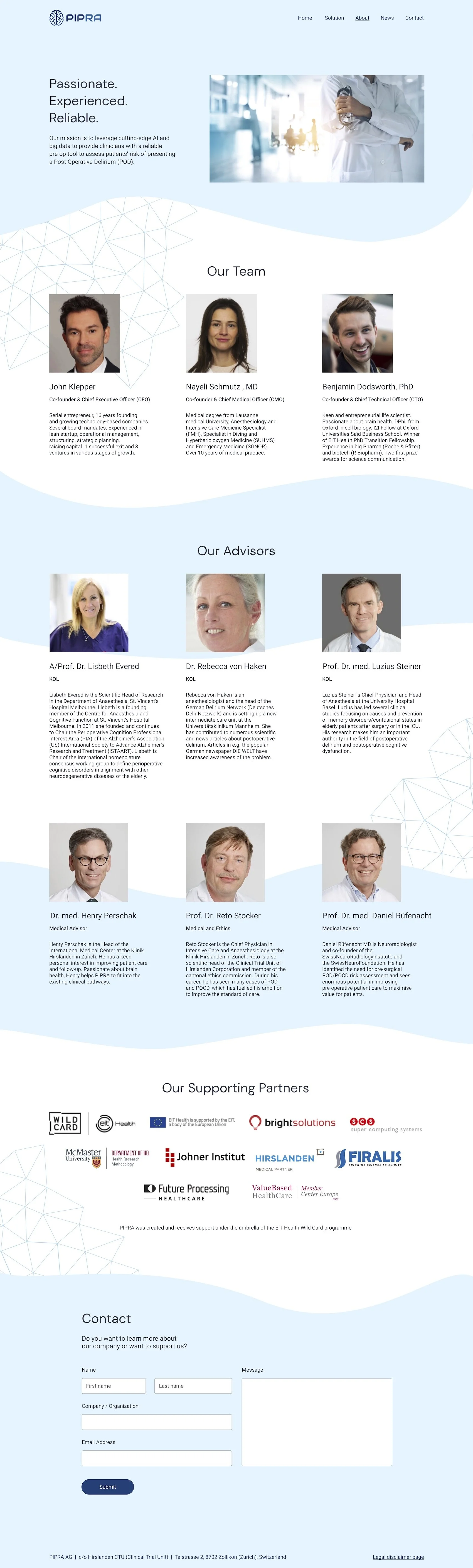
With all the research and defining complete, I was now ready to move on to low-fidelity wireframes. I determined the layout for desktop for all five pages: home, solution, about, news, and contact pages. In creating the wireframes I realized I preferred the zig-zag flow for the content so I used that as the backbone of my design. I also incorporated sections within each page to guide the user to the next page, as defined in the task flow. This reflects the main goal of the project - to provide the user with a guide to learn all about the product and company in hopes that this will influence them to reach out and find out more about the company.
Mood Board
Now it was time to add fidelity to my wireframes. The first step of this process was to get an overall idea of the style, colors, photography, and logos for the site. I used Pinterest to compile examples of the branding I envisioned for my design. I looked at designs for AI, medical companies, and data platforms to help inspire the visual direction I wanted to take the design in.
High Fidelity Designs
Using all of my branding elements, I added fidelity to my wireframes. This involved image selection, determining the placement of the color schemes and elements, and adding additional detail. I decided on a blue color scheme to reflect the goal of inspiring a level of trust with the company and product. I also added a data map inspired graphic to tie into their AI product. The overall goal of the high fidelity design was to create a visually interesting and trustworthy design, and guide the user through the information about the company and product.
Desktop

Tablet


Mobile


Prototype
In this phase, I used Figma to create a clickable prototype of my high fidelity desktop design.
Figma Prototype
I used the prototyping tool in Figma to bring all of my pages together into a comprehensive clickable prototype to test if users are able to easily navigate the site.
Test
For this phase, I conducted a usability test using my Figma prototype and created an affinity map to study user interactions with and perceptions of the site.
Usability Test
I selected four participants (two who were in the medical field and two who weren’t) and had them act as if they were a physician and interested in finding out about a new med-tech product that would benefit their patients. I instructed them to navigate the site and evaluate if they received enough information to be interested in exploring the product further.
Test Results
Task Completion Rate
100% task completion among 4 participants
All participants were able to complete the task
Wins
All participants felt that the site was easy and straightforward to navigate
All participants liked the layout, colors, and design of the site
Three participants felt there was sufficient information for them to want to explore the product further
Improvements
Three participants noted that it would be useful to have a “Home” button in the header navigation
Two participants felt there should be more information at the top of the home page explaining the product
Affinity Map
The results from the usability test were synthesized in an affinity map to organize their responses and perceptions and group together similarities.
Final Steps
Following the usability testing, I implemented changes to the prototype based on the user feedback. I then presented the design to the PIPRA team. The team was very happy with the design and we are currently working on implementation.
Conclusion
This project gave me the opportunity to work with an established company to conduct a website redesign. I spent a lot of time researching to get a better idea of their very specific target demographic and what drives physicians to explore new products. This was also an excellent opportunity to expand on an existing brand and trying to make it more interesting and user friendly. This process allowed me to focus on the needs and desires of users and develop an experience that catered to those needs and desires.


